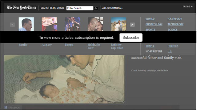
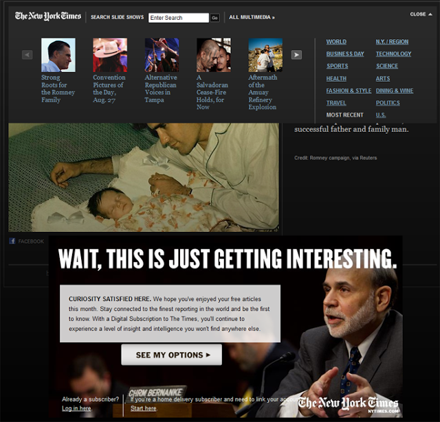
Jacob Nielsen recently wrote about tunnel vision and selective attention. Content presented outside of user's path can become invisible. New York Times fell into the tunnel vision trap. Today I went to take a look at the slideshows. Controls to navigate slideshow carousel don't work, links don't work. Hmm, that is strange. Later I find a note underneath saying "Wait, this is just getting interesting". Oh, it actually means I need to buy a subscription to view more articles.
There are a couple of design drawbacks
There are a couple of design drawbacks
- Subscription information looks like an advertisement (big screaming letters); users ignore content that looks like an advertisement.
- Subscription information is outside of vision tunnel; users' goal is to view the slideshow so they look at the pictures and controls right next to the pictures but subscription information is separated by a big image.
- Subscription headline may sound catchy but it doesn't relate to users. "Wait, this is just getting interesting" doesn't say anything about required subscription.
Current design
Option to redesign the page